
Why Compare Two Periods?
There are various situations when comparing two periods may be necessary. Here are some use cases:
- Performance Monitoring:
- Tracking the evolution of load or behavior of an Oracle database.
- A process took longer than usual: why?
- A process ran faster than usual: how can we understand and sustain this improved behavior?
- Abnormal resource consumption detected: what happened?
- How will a database behave after an OS migration?
- We’re migrating to Linux: what impact will it have on performance or consumption?
- Anticipating Before Production Deployment of an Application Change: ERP, internal development, etc.
- Observing how an environment will behave after an Oracle version upgrade: in 19c, 20c, etc.
- Infrastructure Change Projects:
- Migration to ODA or Exadata.
- Adding or removing CPUs, changing disk arrays, etc.
- Predicting how an application will function on a different architecture to size it correctly.
- And more.
To address all these needs, D.SIDE Replay offers an easy-to-use period comparison feature.
How to Compare Two Periods with D.SIDE Replay?
To use this feature, you only need to collect the two activities you wish to compare.
Here are some examples:
- A trace of a process running well and a trace of the same process running slower.
- A collection when the environment is still running Windows and a collection of the same activity under Linux.
- A capture of current production activity and capture of the load caused by the next application version.
- And more.
Therefore, you can compare activities executed and collected in different environments:
Different OS, different Oracle versions, production with an integration or load testing environment, pre-production, etc.
Select Period 1
Once the two activities are captured and available in Replay, simply select the first period, which will serve as the reference for the comparison:
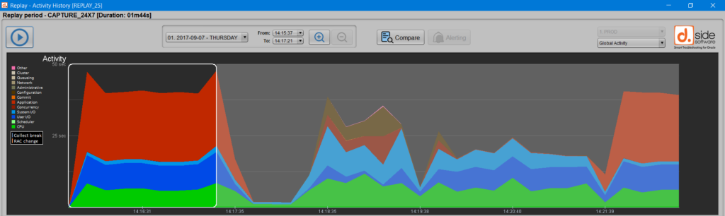
Clicking the ‘Compare periods’ button validates this first selection:

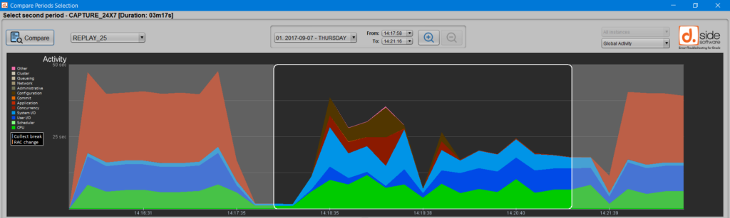
Select Period 2
Next, you can choose the second period, which corresponds to:
- The activity you want to understand retrospectively: slower or faster process, a more heavily loaded machine or database, etc.
- The activity you anticipate: new application or Oracle version, new OS, etc.
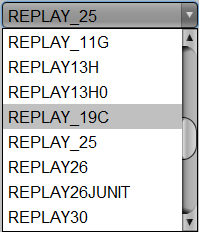
Change owner
In this window for selecting the second period, you can choose a different collection schema to compare captures from different OSs, Oracle versions, or simply different environments. To do this, simply select the new “Owner” from the provided list:
Once the second period is selected, clicking the ‘Compare periods’ button again will take you to the summary and detailed tables for the comparison of these two periods, highlighting the differences between the two selected activities.
To compare periods coming from different environments, two steps are required:
– import, using export_replay_day.sql script (or d.side Console) and import_replay_day.sql script, both periods within a unique database. This database could even be a third database receiving both Replay periods to be compared.
– grant, if both periods are imported into two distinct schemas of this common database, READ privileges for the first Replay user being able to read the second schema. This can be performed:
– by granting to the first user the SELECT privilege on each table of the second schema,
– or by granting a larger privilege to the first user: GRANT SELECT ANY TABLE TO user;
What Does Period Comparison Reveal?
The result of comparing two Oracle activities is broken down into 5 tabs in the “Periods Comparison” window.
Summary and SQL Queries
The first tab, “Summary,” displays the overall behavior of SQL queries, allowing you to quickly assess the stability of their performance and execution plans.
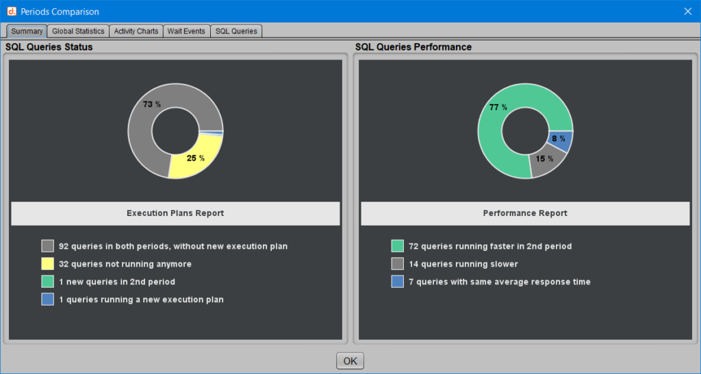
In this example, we can observe in the graph on the left that:
[Green] A query appears only in the second period.
[Yellow] A quarter of the queries (25%) are no longer executed in the second period.
[Blue] A query has changed its execution plan.
[Black] Nearly three-quarters of the queries (73%) are present in both activities without changing their execution plan.
We also learn from the graph on the right, ‘Performance,’ that nearly 7 out of 10 queries run faster in the second period, while 16 queries, or 17% of all queries, are slower.
We thus already have a good sense of the overall trend: the second period of activity appears to be more efficient in terms of SQL performance.
Global Activity
The second tab, “Global Statistics,” shows what the two selected periods correspond to the duration of each period, total and average consumption of time spent in Oracle or on CPU, etc.
More details are provided regarding certain Oracle statistics, including the number of queries executed, the number of committed transactions, the number of logical or physical blocks read, and more.
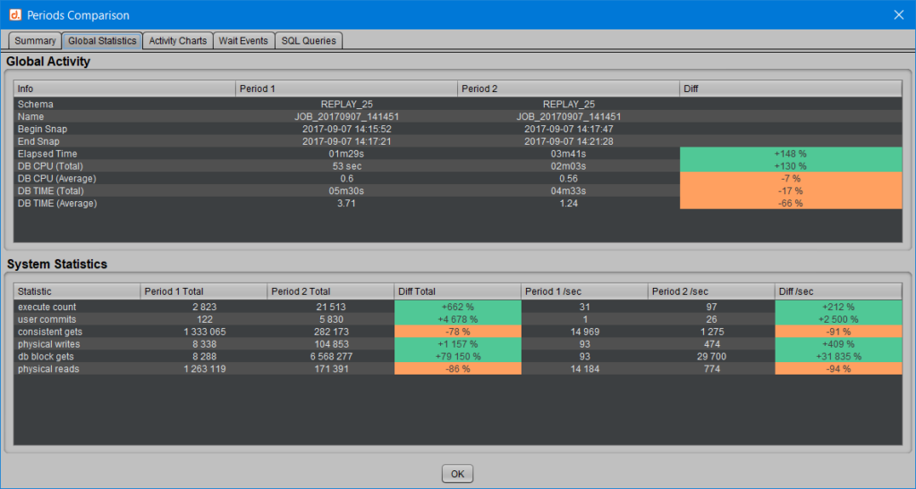
For each of these system statistics, the cumulative total for each period, the average per second, and the difference between the two periods are displayed.
In this tab, beyond the behavior of SQL queries, we can already verify that more transactions were performed while consuming fewer resources in Oracle, including CPU and physical reads.
The color coding is simple:
[Green] A value displayed in green indicates an increase between the first and second periods.
[Orange] A value displayed in orange indicates a decrease between the two periods.
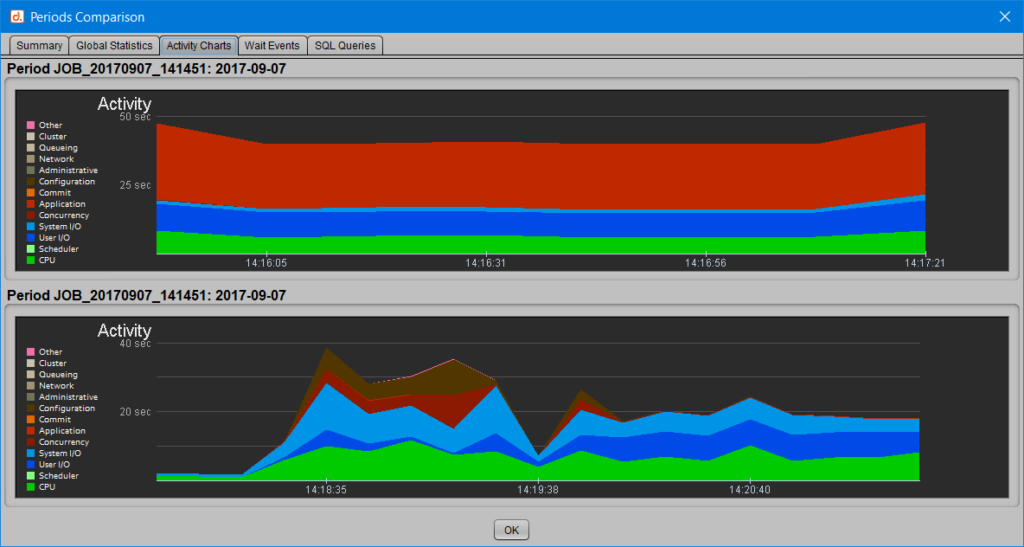
Activity Charts
The third tab, “Activity Charts,” allows you to overlay the activity profiles of each of the two selected periods.
This shows where time was spent in Oracle: CPU and wait classes.
Wait Events
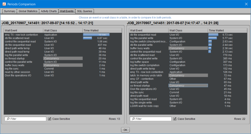
The fourth tab, “Wait Events,” allows you to compare the time Oracle spends on each wait or wait class.
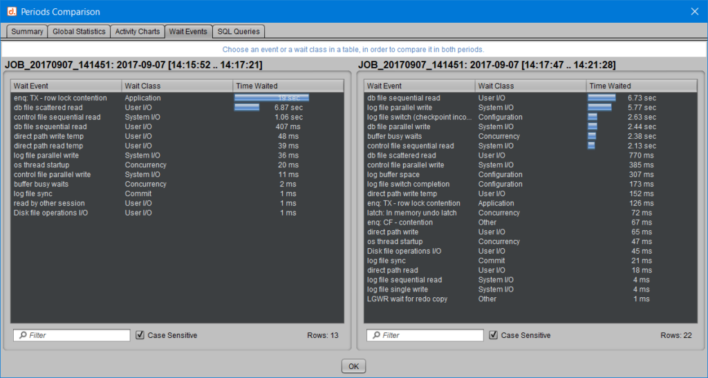
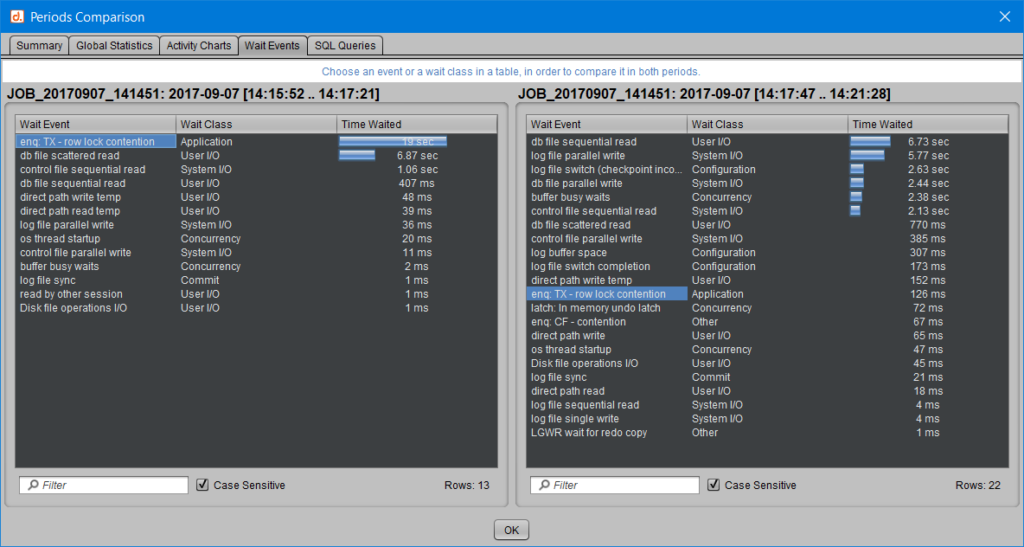
Similarly, you can click on a wait class, and all events within that class will be highlighted in gray in both periods. For example, by choosing to observe the evolution of wait events in the ‘Concurrency’ class:
SQL Query Details
The fifth and final tab, “SQL Queries,” provides a detailed view of the behavior of each query recorded in either of the compared periods.
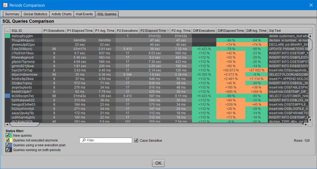
Each SQL_ID is presented with the number of executions, total execution period, and average execution period corresponding to periods 1 and 2, depending on whether the query was detected in those periods.
Here, the color coding for the evolution statistics is slightly different:
[Green] Represents queries that run faster or are executed more frequently.
[Orange] Represents queries with longer response times or fewer executions.
Additionally, if a query is no longer executed in the second period or only appears in the new activity, the ‘Diff’ columns are not populated because there is nothing to compare.
These queries also have a ‘status’ associated with a color, following the same color coding as in the ‘Summary’ tab described earlier:
[Green] Queries that appeared only in the second period.
[Yellow] Queries present only in the first period and no longer executed in the second.
[Blue] Queries present in both periods, with a new execution plan in the second.
[Black] Queries present in both periods and did not undergo an execution plan change.
You can, of course, filter by this ‘status,’ or by an SQL_ID or query text, and even sort to display the queries that improved the most or degraded the most in the second period, etc.
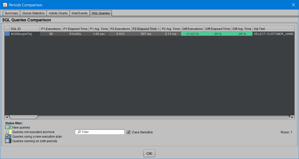
In the example above, only the ‘[Blue] Queries present in both periods, with a new execution plan in the second’ are displayed. We observe for the single SQL_ID concerned that the execution plan change results in a significant performance improvement.
By double-clicking on a query, you can access even more details about its behavior in both periods, such as the overall trend (faster or slower) and execution statistics. If a new execution plan is detected for this query in the second period, both execution plans are displayed, highlighting the differences between them.
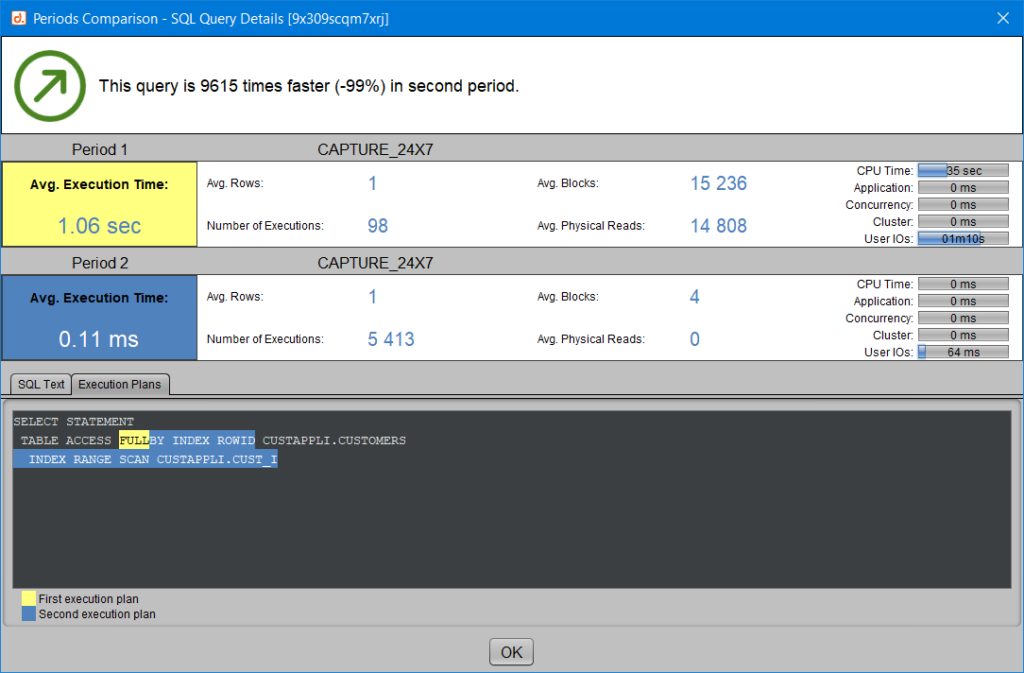
For more information on comparing plans, you can also refer to the article ‘Comparing Two Execution Plans.’
Improvement or Degradation: A Bit of Headroom
In some cases, the variations in consumption or response time between the two activities are so small that you may not want to consider them as an improvement or degradation. If you prefer to view a query that shows little variation between two captures as stable, then using a margin becomes useful. In this case, two statistics that are close enough to stay within this margin are considered equal.
Let’s take the example of a margin set at 5% in the user preferences:
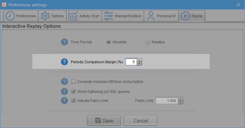
In this case, if the response time for an SQL query between the two periods does not exceed 5%, it is considered stable, meaning its period has neither decreased nor increased.
Let’s see how this works for a query that lasts on average 60 seconds in the first period and 59 seconds in the second: without the margin concept described here, this query would be considered faster because it gained 1 second. However, with a margin set at 5%, the observed gain (1 second gained out of 60 = less than a 2% improvement) is not enough to classify this query as faster in the second period. It would need to be 3 seconds faster (5% of 60 seconds) to be considered faster, or 3 seconds slower to be considered slower. If, as in this case, it lasts between 57 and 63 seconds, then its behavior is considered unchanged.
Since we compare periods in milliseconds, even a one-millisecond difference would be enough to classify it as either a response time increase or decrease. The use of this margin helps smooth out the result compared to a strict comparison./p>
Conclusion
Regardless of your comparison goal—whether retrospective to understand or analytical to anticipate—it’s very easy to observe positive or negative changes between two Oracle activities and obtain summary or detailed statistics, all in a highly shareable visual format for team collaboration.